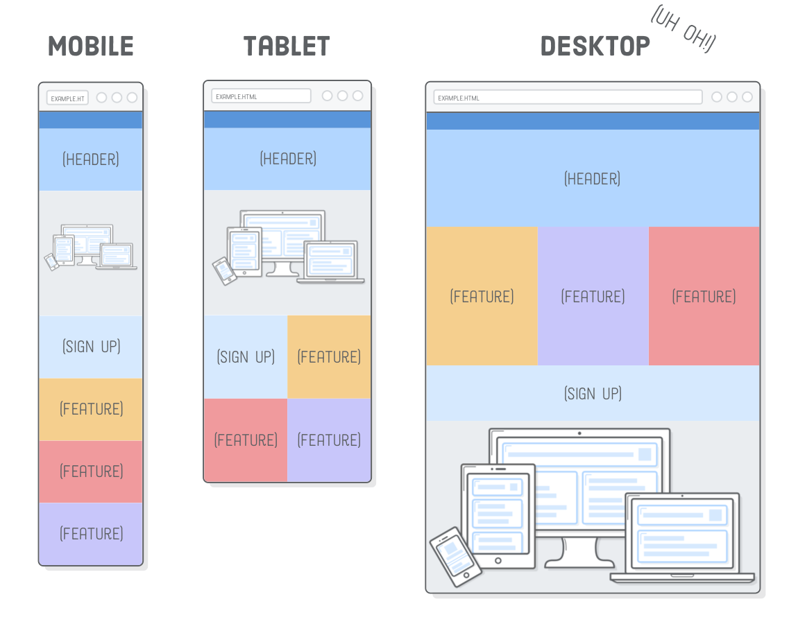
Responsive Images
Just as we use media queries to create separate mobile, tablet, and desktop layouts, we also want to display different images based on the user's device.
The problem is, images have inherent dimensions. We cannot stretch a photo that is 500×250 pixels to anything beyond 500 pixels wide because it will get pixelated.
To make our images responsive, we now have to take three things into consideration:
- The device's dimensions.
- The image's dimensions.
- The device's screen resolution.
Set–up:
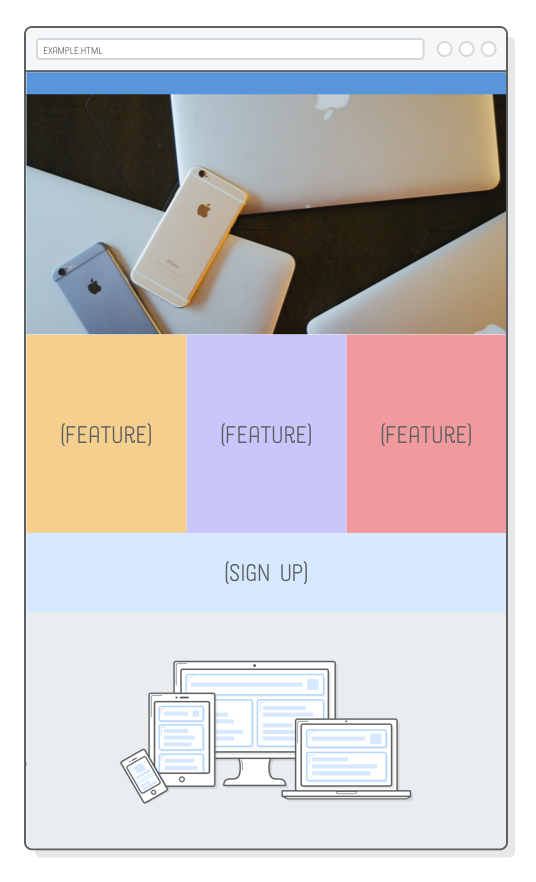
We will build off of the example web page we put together in the previous chapter. We will be adding two images to the page so it looks like the following:
Simply download these image assets and add them to your project's "images" folder.
Your project files should look like this:
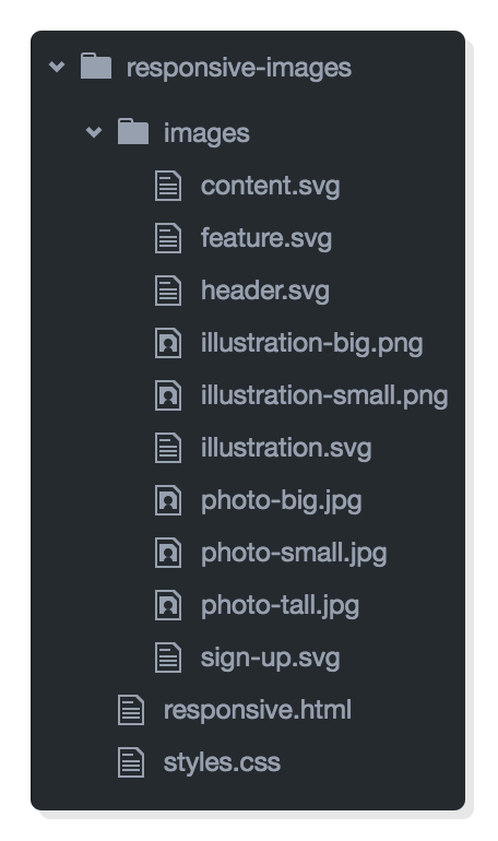
Notice how we have multiple copies of our PNG and JPG images (e.g., illustration-big.png and illustration-small.png).
We will be letting the web browser pick which one of these it should load depending on the device's size and screen resolution.
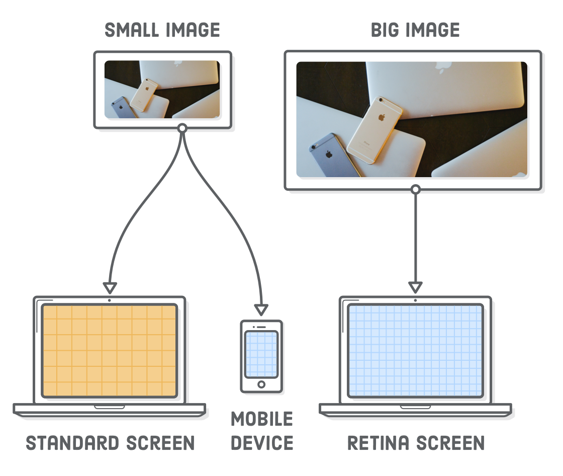
Retina Screens:
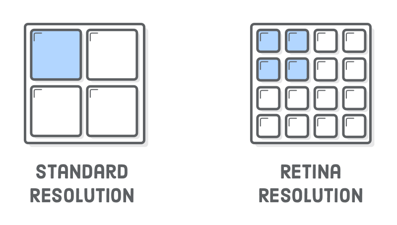
Retina screens have "twice" as many pixels per inch than standard–resolution screens. This means that each retina pixel is the equivalent of 4 standard pixels, which has a big impact on how images are displayed in a web browser.
Thus, in order for an image render correctly on a retina device, it needs to be "twice" as big as its final display dimensions:
For example, if we want to add a 500×250 pixel image to a web page, the corresponding image file needs to be 1000×500 pixels.
Not all retina screens are created equal. For instance, the iPhone 6 Plus has "three times" as many pixels per inch as a standard screen.
Responsive SVG Images:
The easiest way to solve all these problems is with SVG images. Since they are vector–based, SVGs avoid the screen resolution problems.
Browsers automatically “scale up” SVGs for retina devices, so that a SVG image will render crisply on both standard and retina devices.
Although SVGs let us forget about screen resolution issues, we sometimes need to "shrink" the illustration to fit neatly into our fluid tablet and mobile layouts.
To get a fluid image, we need to tell the image to always "fill" the width of its container, like this:
                    .illustration {


                       width: 100%;


                    }
When we specify 100% width on an image, it will assume we want to maintain its aspect ratio and calculate its height automatically which fixes the mobile layout.
However, now the desktop version is huge:
Thus, we need to limit the width of that image to its inherent width, which is 500 pixels. We can do this with an inline style:
<img src="images/illustration.svg" style="max-width: 500px;">


This inline style (applied to the img element) is acceptable since it describes an innate property of that image. An image's physical dimensions are more content than presentation [!], so it makes sense for this to appear in the HTML rather than the stylesheet.
Responsive PNG, GIF, and JPG Images:
Not all images on the web are SVGs. Sometimes you need to include a photo.
PNG, GIF, and JPG images are raster images, which means that they are defined pixel–by–pixel instead of vectors. As a result, they are much more sensitive to "screen resolution" than SVGs.